Harmonizing colors of garden plants is a wonderful challenge to take on as you gain experience. After studying color theory in a previous article, it’s now time to explore the different possible color combinations.
The monochrome garden
According to some color specialists, a monochrome garden is the easiest to create because it consists of only one color. In reality, aside from a white garden, a monochrome garden using any other color is a real challenge. This is because all the plants must have exactly the same hue and tint. For example, if you were to create a pink monochrome garden, all the plants would have to be exactly the same shade of pink, neither lighter nor darker.
Finding plants that are exactly the same color requires a lot of research and a good knowledge of different cultivars. This in-depth research explains the popularity of monochromatic gardens.
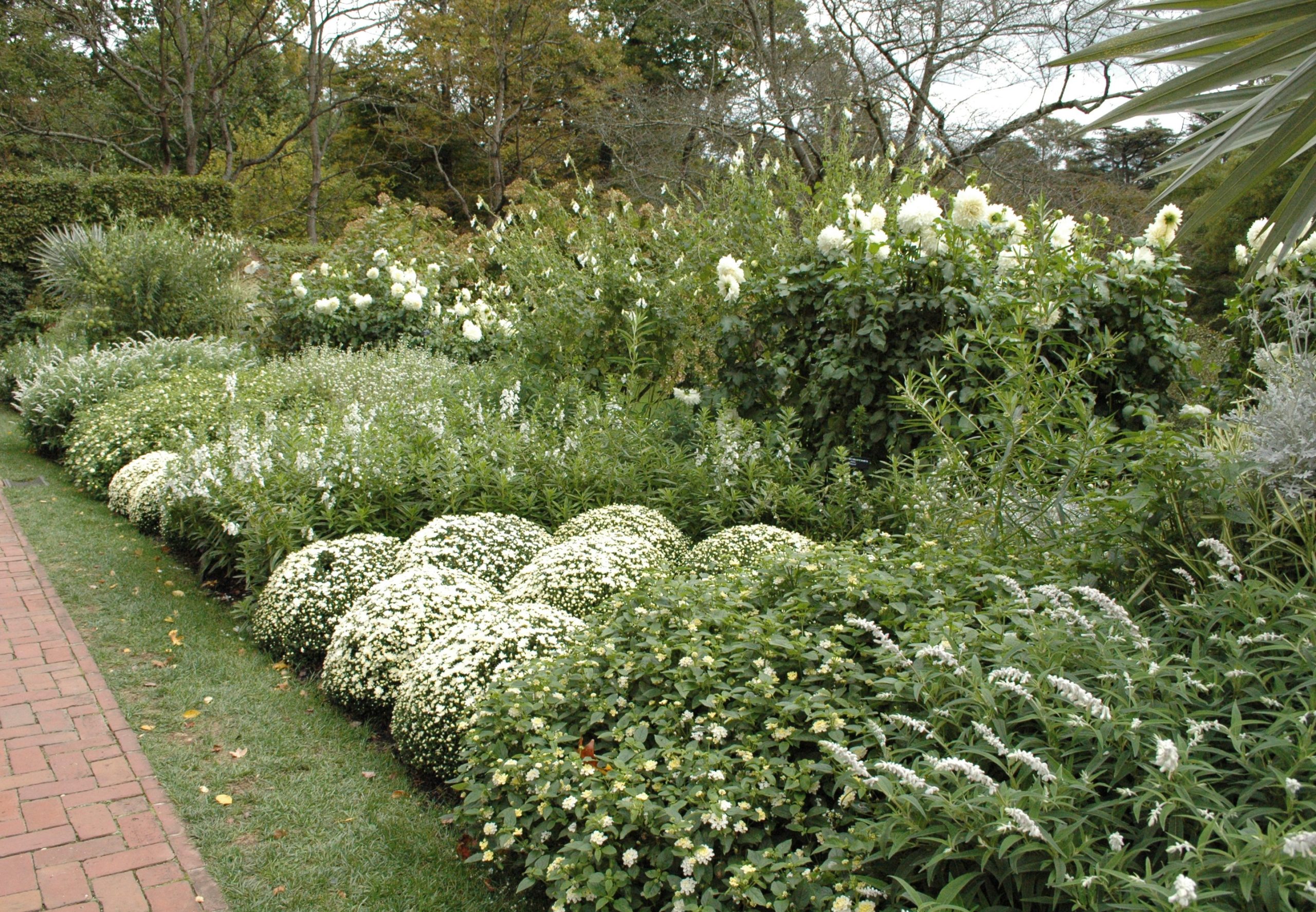
However, their excessive uniformity can sometimes make them seem commonplace. In this type of garden, no color makes its neighbor stand out. Even Gertrude Jekyll, a famous British gardener of the 1920s, believed that “a blue garden must be beautiful before being blue.” She pushed the “insolence” in suggesting the addition of a touch of white or light yellow to make the blues more vibrant. “Then, after being beautiful, the garden can be blue, as best it can be!” she wrote.
The shade and tone garden
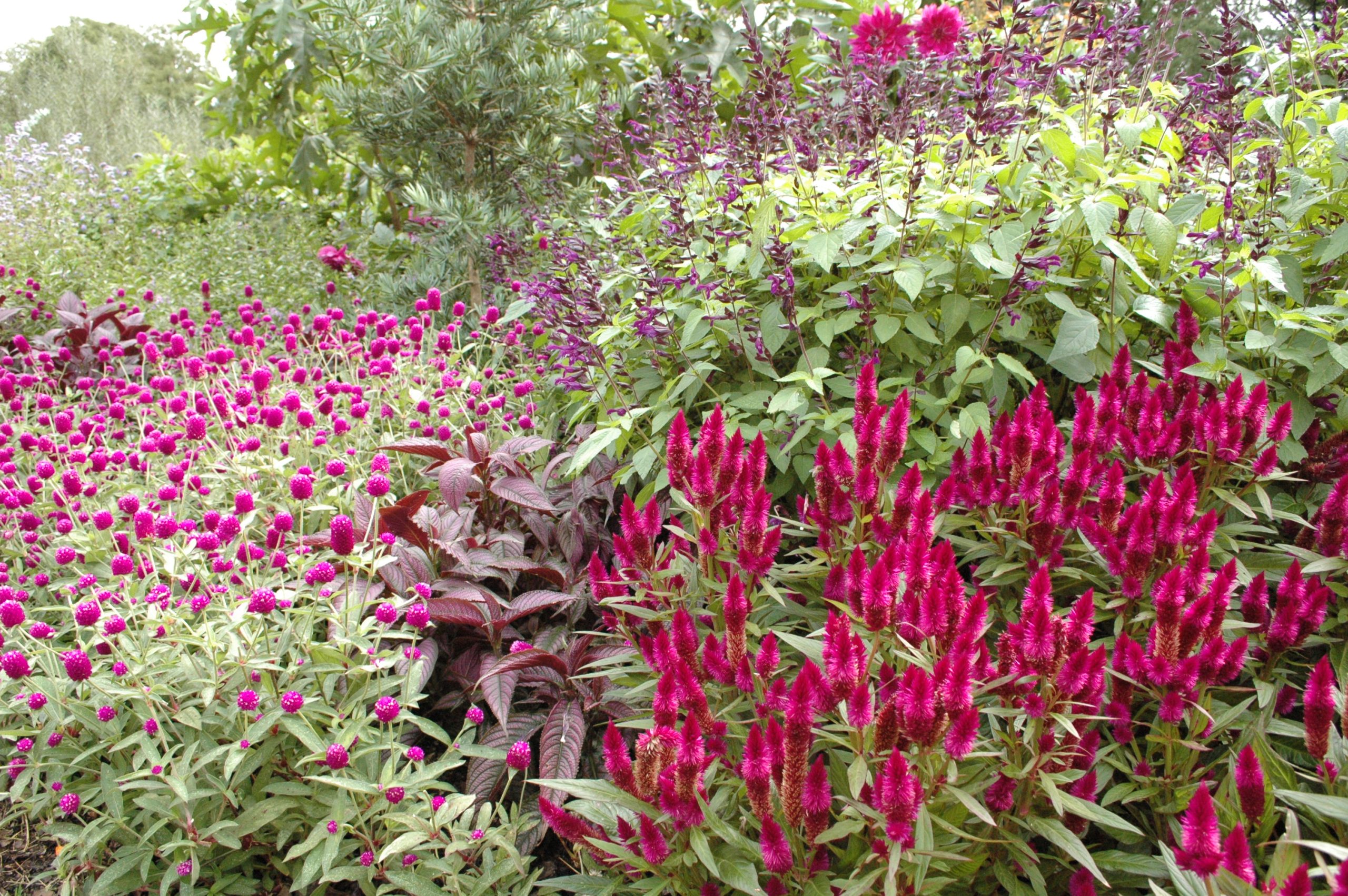
Also called camaieu, this composition would be an assortment of colors, all derived from the same base color. Here, the focus is on playing with tones and shades. Thus, a pink garden would incorporate all the variations of the color pink, from pale to dark, from cool to warm tones.
Some gardeners claim that a camaieu garden is a failed monochrome garden! This color scheme is more interesting than the former because it’s less uniform. The different colors harmonize easily when combined. It’s an easy garden to create.
I often advise beginning gardeners to start with a tint-and-shade theme because it’s a foolproof way to arrange colors. Pick a color and stick with it! Do you love mauve? Group together all the plants with mauve, violet, purple, lavender, or plum flowers. Success is guaranteed!
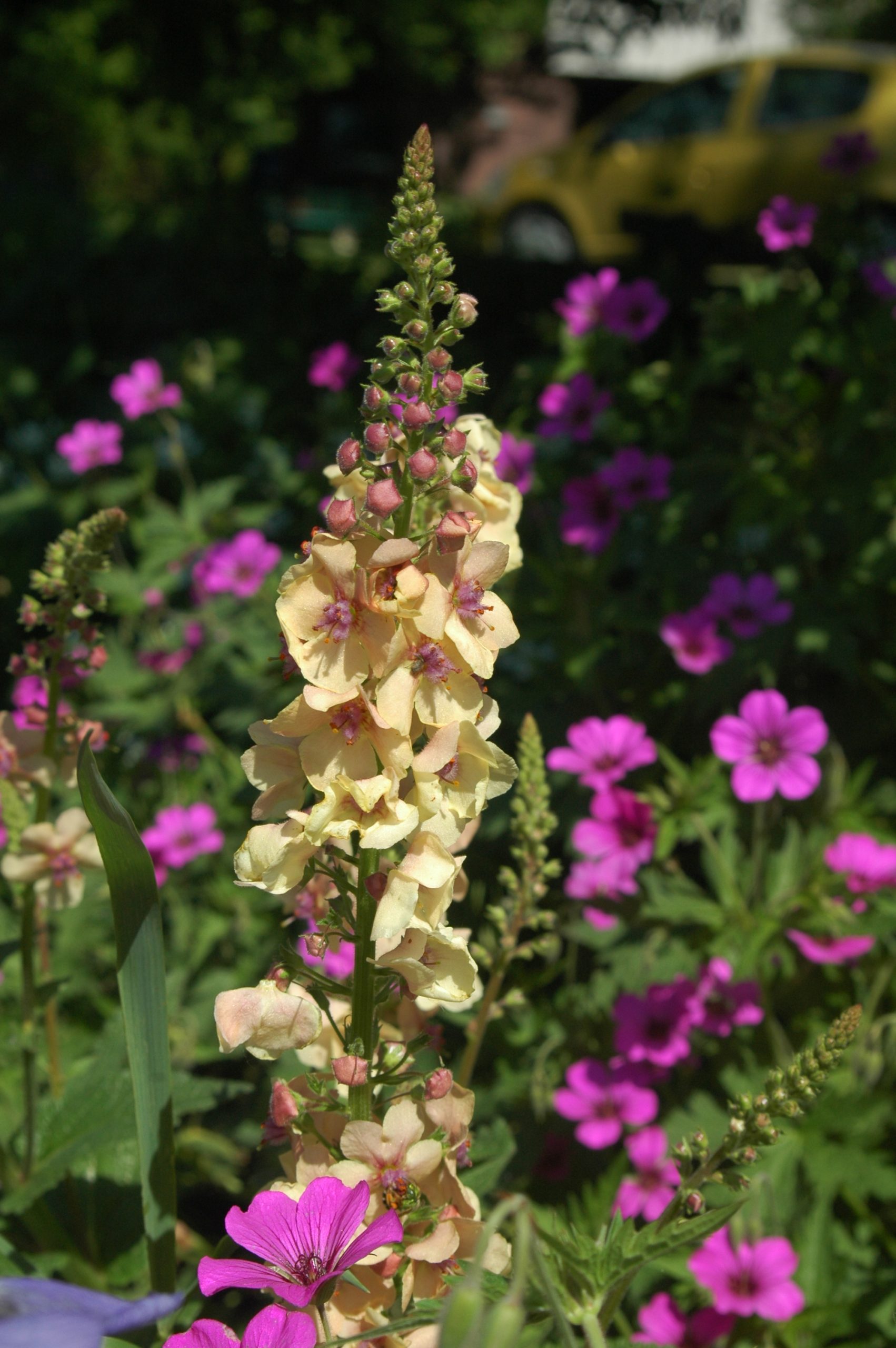
The harmonious garden
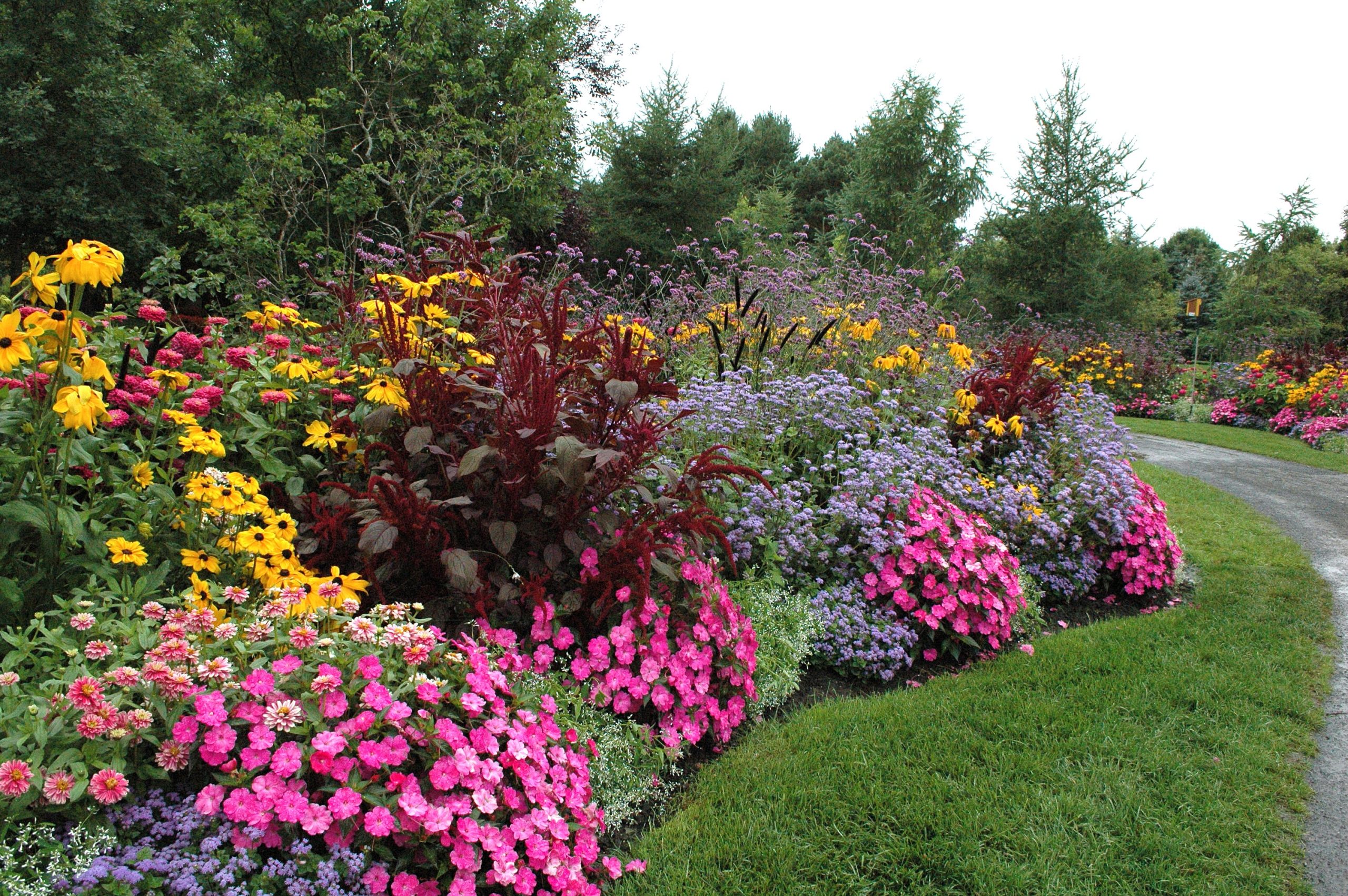
A color harmony is a combination of colors that blend beautifully. There’s no precise technique for determining the colors in a harmony; the result is simply pleasing to the eye. The most common color harmony is a mix of pink and mauve at different intensities. Sometimes a subtle touch of pale yellow is added. In a harmonious color scheme, uniformity is key. Don’t hesitate to reuse the same plant multiple times. Nothing clashes in a harmonious scheme.
Harmonies are sometimes described as arrangements of analogous colors. This refers to an arrangement of plants whose colors are adjacent on the color wheel. For example blue, mauve, and magenta. This is also an excellent approach for creating harmonious gardens.
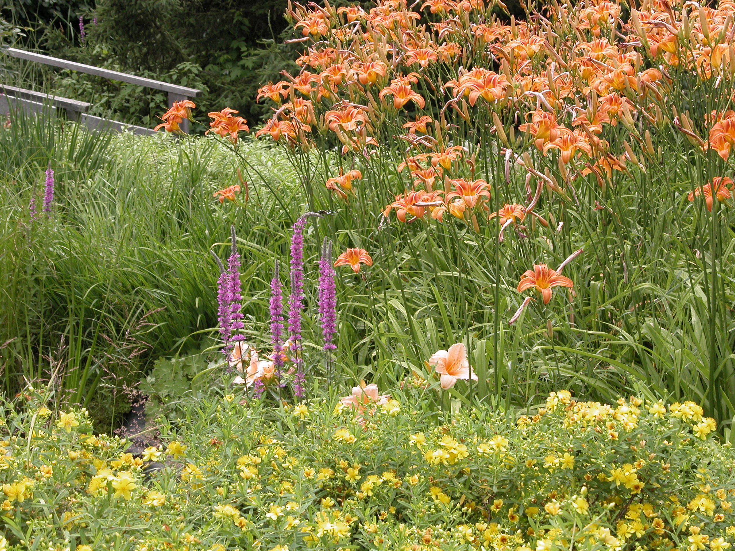
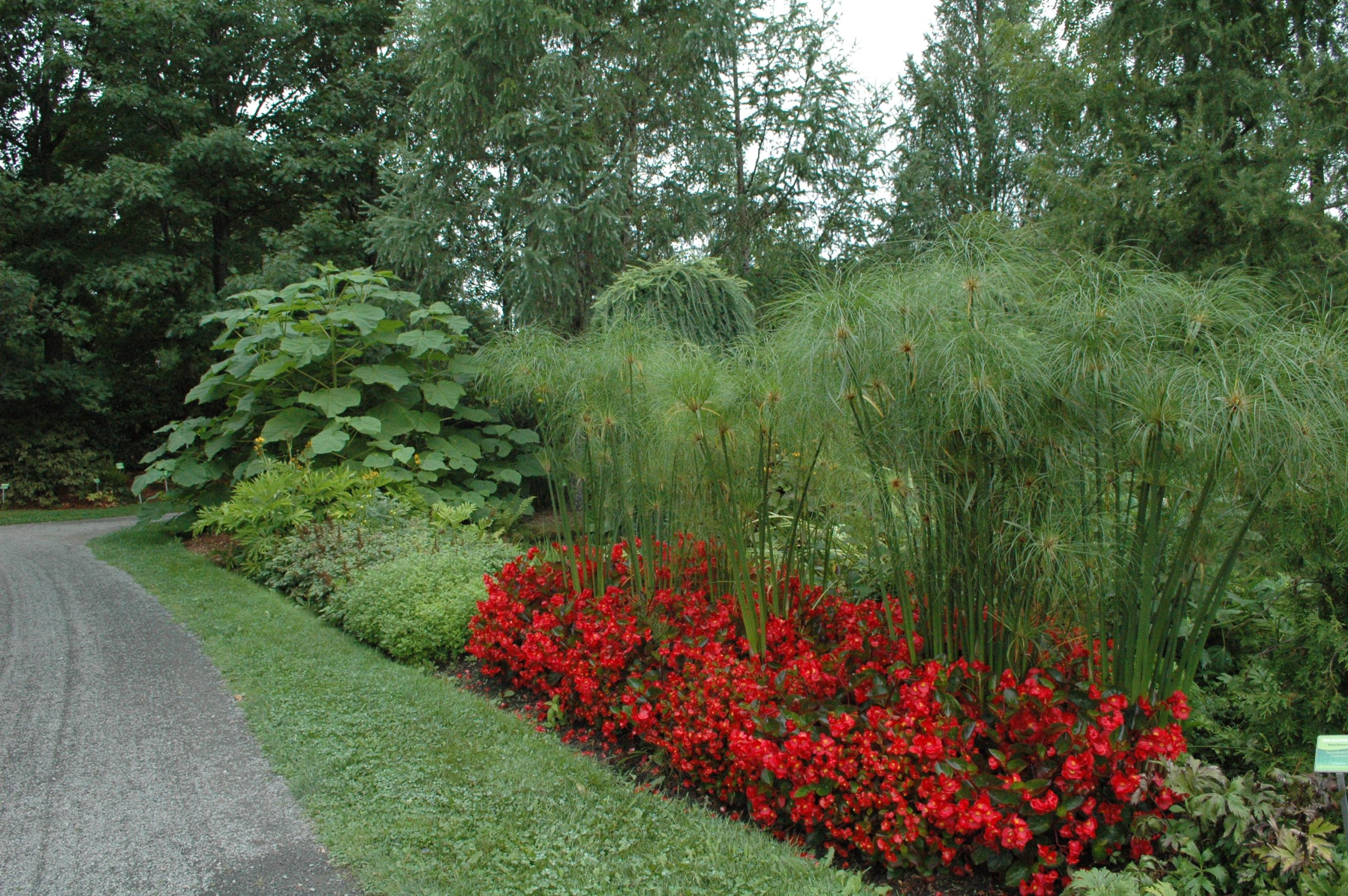
The garden of contrast
In color theory, contrast is the opposition between a primary color and its complementary color, that is, the two other colors mixed together. For example, yellow contrasts with purple (red and blue), red contrasts with green (yellow and blue), and blue contrasts with orange (red and yellow).
However, in the garden, two colors that clash with each other can be considered contrasting colors. Dark blue (like that of a larkspur) against bright yellow, or red against white. As soon as a cool color (white, blue, purple) is juxtaposed with a warm color (yellow, orange, scarlet), there is contrast. That said, a golden yellow will contrast with a bright red… two warm colors!
In other words, color theory helps in part to create successful contrasts, but several other options are more in the realm of feeling.
While you can use a lot of tone-on-tone and harmonious colors, contrasts should be used sparingly. A touch here. A touch there. That’s all! Too much contrast can create visual clutter. Visual clutter is like a pizza! That’s exactly the effect we don’t want in the garden. This will be the subject of the third and final post in this series.
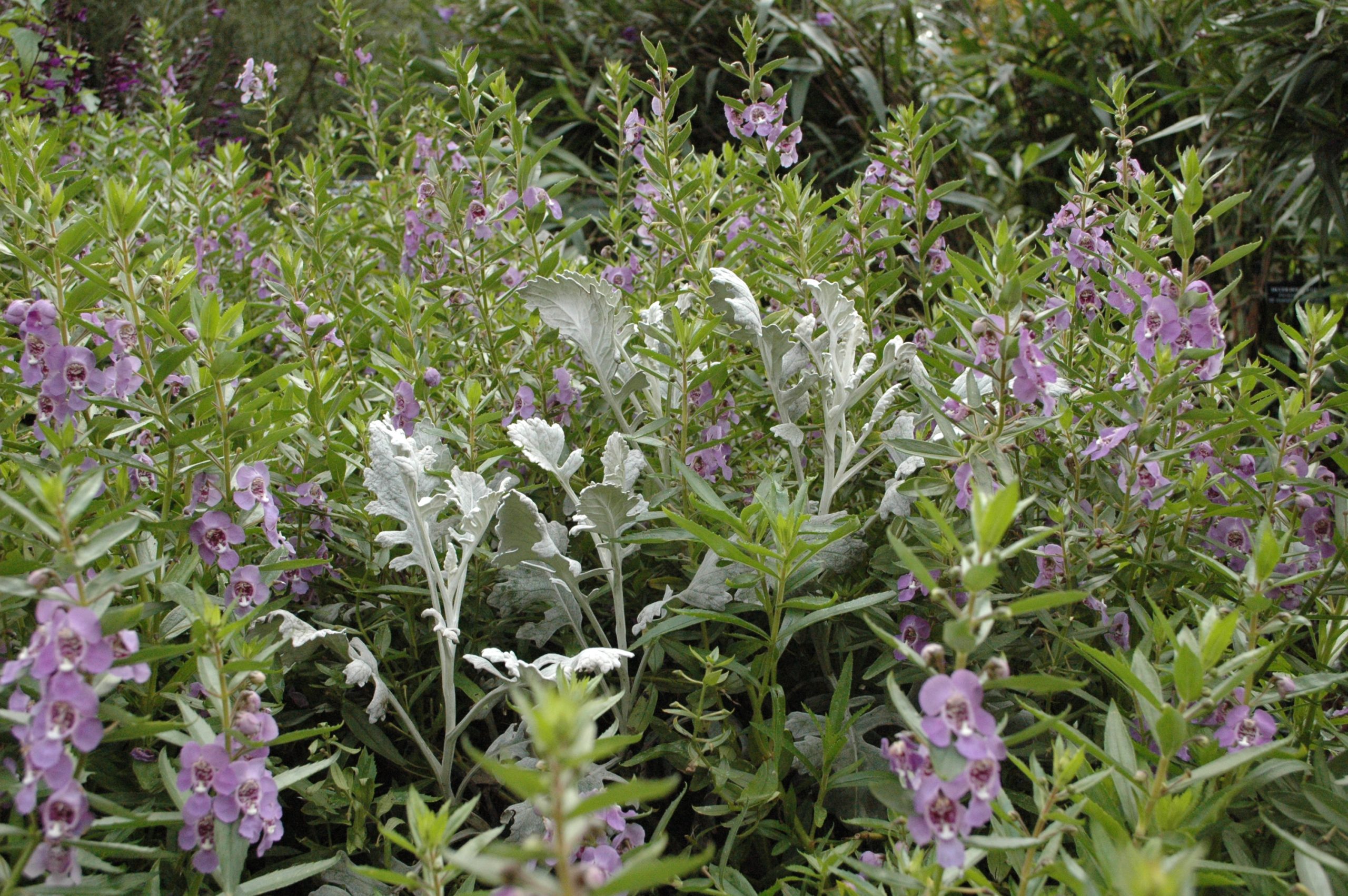
The role of white and grey
White and gray are colors that harmonize with everything. They are sometimes essential for enhancing the color of certain more understated flowers. For example, purple flowers can get lost in green foliage, against which this color struggles to stand out. This is where a touch of white, in front of, behind, or among the purple flowers, becomes very useful.
White makes dark colors more vibrant and vivid. Generally, white is considered a neutral color, but that’s not entirely true. While it’s true that white goes with all colors, it’s a color that often adds contrast to the garden.
The true neutral color is actually gray. Gray is more discreet. The eye isn’t drawn to gray. It can be used to redirect the gaze to a point of interest. A clump of gray foliage alongside the star plant and another patch of gray slightly behind it helps the eye focus on what’s interesting. Gray is also the solution for separating two plants that don’t harmonize well together.
And here’s where the real fun begins! With these four color combination approaches in hand, the real work of designing the garden starts. Now it’s time to pull out the photos and see which plants work well together and which ones clash. My best advice is to choose one approach and stick to it for the entire flower bed. Anything that doesn’t follow the chosen rule should be moved to another bed.
What are your best gardening tips? Show us photos of your garden on the Laidback Gardener’s Facebook page!
Really enjoyed this follow-up — it makes color design feel much more practical. The breakdown between monochrome, tone-on-tone, harmony, and contrast gives a clear way to approach planting without getting overwhelmed.
I especially like the idea of sticking to one approach per flower bed. It’s such a simple rule, but it probably prevents that “too many colors at once” effect you mentioned — where everything starts competing instead of complementing.
That balance between structure and creativity is interesting because it shows up in other areas too — knowing the basics, then applying them your own way. If you’re into that kind of strategic thinking, even outside gardening, this is worth checking out: https://dexsport-odds.net/casino/
Great article Julie. You can go down a very deep rabbit hole when discussing colour with someone who loves to dabble in colour theory. I have a theory too that people either love pastel hues or contrasting hues. I love it all.
Great articles, Julie! When I became more experienced I said my garden was spotty. I like the pizza analogy better!